If you use Google services like Gmail, YouTube, or Google Drive, you will soon notice a change in the appearance of the pages you log in to. Google
announced today that it updates the look of its login pages with a cleaner, more streamlined design.
This new aesthetic aligns these pages with the Material Design language used in other
Google products, such as Gmail and Search, creating a unified and familiar experience. As previously announced, this redesign will be rolled out across the web and mobile devices.
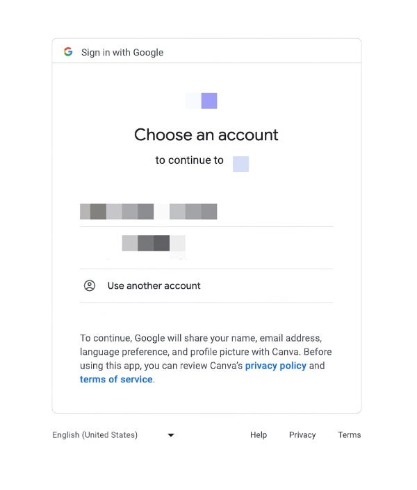
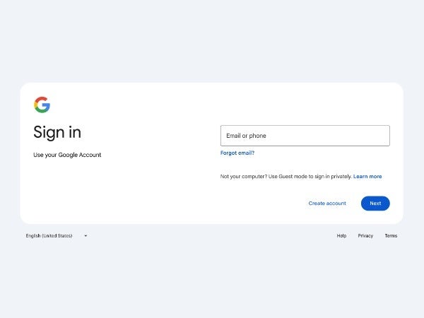
The new look features the usual Material Design elements, such as accentuating rounded corners and soft colors. There is now a pill-shaped button for “Next” and places the “Email or Phone” field to the right of the Google logo and “Sign in” header. The all-too-familiar language switcher, help, privacy, and terms links remain directly at the bottom, as they were before.
The key change is purely visual – think of it as a fresh coat of paint. You'll see a cleaner interface and a layout optimized for the screen you're using. Most importantly, however, is to know that the way you log in remains the same, as you will continue to use your familiar email address (or phone number) and password. It's a small change, but it makes the login process a little more intuitive and user-friendly.
Old and new Google login page on the web
The redesign is now gradually rolling out to all personal Google account and workspace users and will apply to all devices: phones, tablets and computers. The expected rollout completion date is March 4, so expect to see this new login page in less than two weeks. End users and workspace administrators do not need any action as it is a simple visual refresh.