

Google Maps’ confusing new color palette has now reached Android Auto،
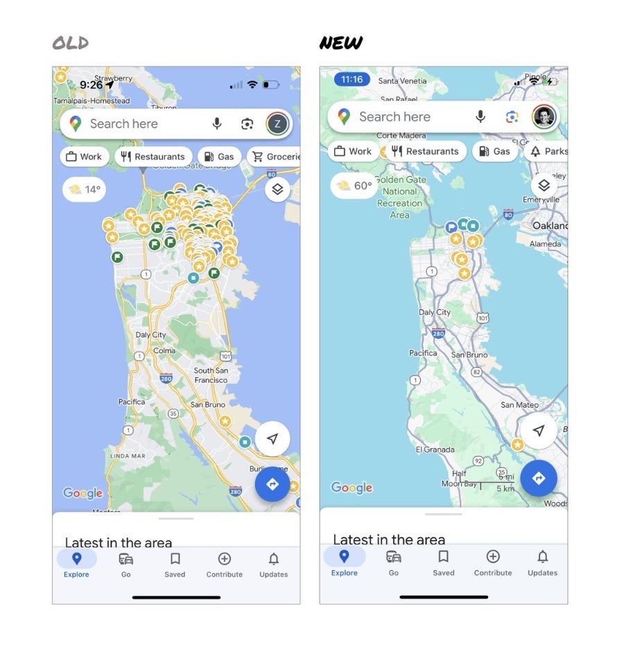
Google Maps has undergone a significant visual transformation announced by the company earlier this month. This redesign included a few new features, but also introduced a new, cooler color palette that was met with mixed reactions. While the initial rollout only included Android, iOS, and web versions of Maps, it is now also rolling out to its Android Auto counterpart.
The goal of this change was to make the roads stand out more against the backdrop of parks and forests, which now feature a lighter shade of green. Additionally, highways have been given a darker gray tint with subtle blue undertones, blending in seamlessly with bodies of water which now display a lighter blue tint.
These changes are complemented by a reduction in the use of yellow, making orange restaurant pins more distinguishable. This design choice aims to ensure that key points of interest are easily identifiable, thereby improving the overall usability of the app. The new color palette also extends beyond the map itself, permeating the app’s UI.
Source – @elizlaraki on X
Google has been gradually rolling out the new color scheme since October, with testing starting in August. The update is now widely available across web, Android, and iOS platforms, including Android Auto. It remains unclear what Google’s position is regarding user complaints or whether the company intends to implement further changes.